“I know only one
thing. When I sleep, I know no fear, no trouble, no bliss. Blessing on him who
invented sleep."
Stanisław Lem, "Solaris"
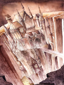
This is a kind of prelude to the tutorial about 3-point perspective. I'll present here how the drawing was created step by step. Whereas principles of perspective will be explained in the next few days in a downloadable tutorial somewhere here http://grimdreamart.blogspot.com/p/tutorials.html. (At least that's the plan)
1. Setting
a composition. Guiding lines were made with a pencil:
2. Aha!
experience - it will be a castle. At this stage there are lots of
constructional lines and I'm still not sure what shape the castle should
eventually have. Using a pencil rather than a pen is much more safe right now:
3. When all
what's desired is fixed with a waterproof pen (Faber-Castell Pitt Artist Pen is
my personal favorite), we can get rid of additional interrupting lines. Well,
it doesn't look excessively awesome, so...
4. Let's
make some additions: windows, ornaments, dragons. It's immediately more
cheerful, isn't it?
5. Time for
watercolors. It's better to start with the environment before we'll go to the
main subject. Apparently it's not necessary to choose
warm colors for the foreground and the colder ones for the background. In some
circumstances an exactly opposite approach can also work out well. Let's try
it!
That's how
the background looked like before it dried up. Grains of salt bravely absorb
water and leave a fancy pattern:
6. These additions
mentioned in the step 4...ekhmm, they're easier to draw with a pen than to
paint with watercolors. I should have thought about that earlier...
7. Now it's time for textures made with a thin brush and dense paint. What's even more important I had
to work further on overall color settings and unify the whole painting. It required using a
broad brush and diluted paint (yellow, purple and opaque gold):
8. Working
on details with a pen once more. The whole drawing looks more "sharp"
that way:


No comments:
Post a Comment