Pages

Wednesday, 7 February 2018

Medieval Town - video courses

Recently I finished preparing a Skillshare course about designing fantasyarchitecture. I presented there many architectonic details drawn from imagination, talked about the rules accompanying medieval builders and highlighted many frequently made mistakes in designing fantasy architecture. An important part of the course are “case studies” - four detailed illustrations summarizing four chapters of the course.

I explained there a designing process based, among others, on historical and constructional aspects. In this blog post, I’ll shortly present how they were drawn step by step. Today it’s time for a little, medieval town square.    


1.      If you don’t know, what is presented here, I don’t blame you. Luckily for me, shortly after that (i.e. before I forgot what I was thinking about) I began to draw a full-size, neat sketch.


2.      If you don’t know what to draw, just start with a horizon line placed in 1/3 or 2/3 of the height of the frame. Drawing vertical lines in 1/3 and2/3 of the width of the frame should be also helpful in setting the composition. I added also a few other divisions. Easy stuff so far 😊


3.      Probably now you can see, that there will be two fragments of buildings on the foreground (on the right and the left) and some houses with a bridge/gate in the background. Medieval towns quite often had irregularly shaped roads and “squares”. That’s why there are two different vanishing points for these two foreground buildings, as they are not meant to be parallel. It’s also time to decide how high the floors should be.


4.      Defining actual shapes of the buildings. Do you see the striking similarities with the first concept sketch?


5.      Marking the most important details, which should give some character to the scene.


6.      Further delving into the details…


7.      Erasing pencil lines and leaving only the fine, ink drawing.


8.      Seems like a big step forward in comparison with the previous one, but this part in fact required relatively little thinking and lots of arduous work. The one important aspect here was a decision about the light direction.


The next post will be dedicated to the third “case study” from the course - “Swamp Fortress” (I hope that the title is a bit intriguing).

In the meantime, you can take a look at how this medieval town square was colored with watercolors in sepia tones!

Friday, 2 February 2018

Slavic Hut - video courses

Some time ago I decided to focus on making video classes. I’ve been asked for that quite a few times, but it required resources and time, so the courses have been postponed constantly. Until now! The course about designing fantasy architecture was prepared (with loooong breaks) for about a year. For some strange reason, the hardest part appeared to be self-presentation…

Anyway, now it’s finished, so if you would like to get to know the rules of designing imagined buildings for a need of games or books, or if you just would like to take a look at the whole mass of hand-drawn more or less fantasy details and listen about medieval buildings you can visit my Skillshare page (link to my profile). 

In this course, besides plenty of many details, I presented also a few “case studies” which are detailed illustrations based on the knowledge handed in the course. I explained there WHY these illustrations look the way they look and here I’ll explain HOW they were drawn step by step.

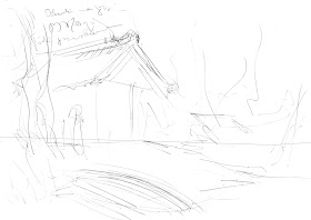
1.      A small and super fast concept sketch with side notes. What a potential, Ladies and Gentleman! Nah, the aesthetic aspect is not the strongest point here. What does matter is capturing the right composition and it’s much easier on a small piece of paper and without worrying about drawing fine, straight lines.


2.      The first line was the horizon line. Then I marked the basic parts of the composition. The corner of the hut is placed in the 1/3 of the width of the frame. The boat and the roof lines are pointing to the main tree.


3.      Adding more structure: reed, a fence, some strange skulls, a large stone with magic symbols (also placed in 1/3 of the width of the frame). The “Thundermark” on the stone is a symbol of Perun – the God of warriors and lighting (in other words a Slavic version of Nordic Thor).


4.      After clarifying the most important elements in the previous step, I feel confident enough to draw with ink. I traced here the pencil sketch with a little more awareness of materials(note that wooden beams and the forked pole are more organic than geometric now).


5.      Textures and shadows - part I. In my humble opinion, the XIXth century craftsmen were absolute masters in capturing textures and material structures, so after short googling, I got some inspiration.


6.      Textures and shadows - part II. It took me ages… or at least a few hours.


And then I colored it with watercolors! If you are curious about how it proceeded and eventually the illustration turned out, just click below 😊


In the next post, I’ll present another “case study” from my course – a medieval town square.