Some time ago I decided to focus on making
video classes. I’ve been asked for that quite a few times, but it required
resources and time, so the courses have been postponed constantly. Until now! The course about designing fantasy architecture was prepared (with loooong breaks) for about a year. For some
strange reason, the hardest part appeared
to be self-presentation…
Anyway, now it’s finished, so if you would like to get to know the rules of designing imagined buildings for a need of
games or books, or if you just would like to take a look at the whole mass of
hand-drawn more or less fantasy details and listen about medieval
buildings you can visit my Skillshare page (link to my profile).
In this course, besides plenty of many
details, I presented also a few “case studies” which are detailed illustrations
based on the knowledge handed in the course. I explained there WHY these
illustrations look the way they look and here I’ll explain HOW they were drawn
step by step.
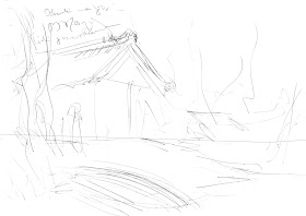
1.
A small and super fast concept
sketch with side notes. What a potential, Ladies and Gentleman! Nah, the
aesthetic aspect is not the strongest point here. What does matter is capturing
the right composition and it’s much easier on a small piece of paper and
without worrying about drawing fine, straight lines.
2.
The first line was the horizon
line. Then I marked the basic parts of the composition.
The corner of the hut is placed in the 1/3 of the width of the frame. The boat
and the roof lines are pointing to the
main tree.
3.
Adding more structure: reed, a fence,
some strange skulls, a large stone with magic symbols (also placed in 1/3 of
the width of the frame). The “Thundermark”
on the stone is a symbol of Perun – the God of warriors and lighting (in other
words a Slavic version of Nordic Thor).
4.
After clarifying the most
important elements in the previous step, I feel confident enough to draw with
ink. I traced here the pencil sketch with a little more awareness of
materials(note that wooden beams and the forked pole are more organic than
geometric now).
5.
Textures and shadows - part I.
In my humble opinion, the XIXth century craftsmen were absolute masters in
capturing textures and material structures, so after short googling, I got some inspiration.
6.
Textures and shadows - part II.
It took me ages… or at least a few hours.
And then I colored it with watercolors! If
you are curious about how it proceeded and eventually the illustration turned out, just click
below 😊
In the next post,
I’ll present another “case study” from my course – a medieval town square.


No comments:
Post a Comment