Showing posts with label handpainted. Show all posts

Saturday, 2 November 2019

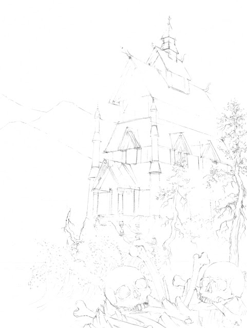
Mysterious Temple


Ha! I bet that you totally forgot about my blog… I apparently did. A year and a half of silence would suggest that anyways.

The illustration below was actually made over one and a half year ago, which could confirm that I haven’t drawn anything since a looong time. But that’s not true, I swear. I’ve been just extremely busy with projects I cannot share with you… yet.

I’ll be brief (just as a busy person like myself should be).


In the beginning, I made a few concept sketches. Not real pieces of art, I know. But don’t lose hope:

Outlines drawn in pencil:

Some details in waterproof ink:


The whole building and the foreground were masked with masking fluid to protect these areas from being painted over with very liquid paint (“wet on wet” technique). Mountains were salted to achieve these textures:

Working on the sky with watercolor paint mixed with gum arabic. Previously masked areas were painted slowly and carefully:

Hmmm… looks almost like the previous step. Maybe I just wasted my time, but I actually added some extra precise shadows and highlights with ink and dense white watercolor paint:


Saturday, 23 September 2017

BLIGHTINGALES - music album illustrations


Based on my long and insightful researches (i.e. checking “likes” on Facebook and Behance and posting a one-question questionnaire on DeviantArt) I discovered, that my viewers/readers are most interested in my gothic illustrations.

Oddly enough, I don’t have too many opportunities to make such artworks. But today I can finally share with you a mysterious, ruined gothic cathedral painted as a cover illustration for a grey-metal (doom-death-symphonic black) band “Darken My Grief”.


So far I could only listen to a few demo fragments, but I hope I managed to capture an appropriate atmosphere. Luckily the band’s frontman – Duddu had quite a clear vision regarding the whole graphic design.  Considering this, the task may sound like a piece of cake, but in practice, it meant seemingly endless editions of the whole mass of tiny little elements. Apparently, that’s what happens, when two perfectionists meet. Anyway, the final result was worth the effort!

One of my ugly concept sketches – let’s call this phase “a necessary pain”. Probably at this stage the clients are seriously wondering whether they made the right choice when hiring me:

The final illustration – I had almost a total freedom here. The only requirement was to capture a woman and a flock of birds. So I decided to put them in a gothic environment (with cathedral’s ruins in a shade of whitened bones. Charming, I know):

The front cover design:

The back cover illustration (probably you can notice letters DMG hidden in the central symbol resembling an angel – this symbol is actually frontman’s brilliant idea):

Some of the lyrics backgrounds:


And now I’m waiting impatiently to listen to their music...