Showing posts with label akvareller. Show all posts

Friday, 19 January 2018

SÖDERMALM, STOCKHOLM

“Been there, done that, got the T-shirt”

I guess I haven’t painted any existing landscapes since a long time... Oh, I just had to check it. I haven’t painted any existing landscapes since May 2015, which gives us over 2,5 year! Looks like my record. This previous painting presented a high school building from my hometown.

This one is a view of an island where I’m living right now. Nah, I’m not living in any of those buildings, but the surrounding is pretty awesome anyway.

There are sooo many inspiring places in Stockholm that I would like to draw. I’ve even made a short to-do list, but, as always, lack of spare time can thwart my plans.

To the point! Drawing process:

1.      An accurate pencil sketch:

2.      I started painting (as usually) with the sky. Then it came turn for roofs. 

3.      And the walls. I used here a thin brush with a flat tip.

4.      The next step was painting windows and finally, the water reflection. OH, MY GOD, I’ve been struggling with this reflection so hard.

I'm glad that it's finished. I just hope that I won't have to wait another 2,5 year for painting some nice, real view :) 


Friday, 13 November 2015

Medieval Battle


"Expanding Comfort Zone" part...next. One of the most important aspects of a good portfolio is showing an ability to draw various themes (do not confuse with variety of styles!). When browsing through my old portfolio I encountered medieval buildings, steampunk buildings, fantasy buildings and some existing buildings. In short - it was quite monothematic. Ok, maybe I'm exaggerating. There were also guitars. Still, it was quite far from presenting diversity of themes.

My portfolio needed more people, more animals and more dynamism (nope, torn Ghost Ship's sails  flapping on the wind don't really count as "dynamic"). How about a battle scene? It usually requires participation of a group of people, right? Dynamism is also automatically incorporated. Let's add animals in the form of horses and we will have a complete package.


1. Tadaaaa:

Not oh-so impressive, I know. Luckily it's just my 2-minutes chaotic sketch. Hopefully the final result will be a little bit better.

2. Detailed pencil drawing. The more details are drawn with an easy-to-erase pencil, the less decisions need to be made during the watercolor part:

3. The background. It's almost invisible, but I prefer to keep it very delicate at this stage. Probably after painting these fighting guys, I'll add more contrasts or details to the background. In case of watercolors adding it's always easier than withdrawing.

4. The fighting guys and their brave steeds, stage 1. Tiny little details will be added later.         

5. The fighting guys and their brave steeds, stage 2. Tiny little details were made with brown and white opaque ink. 

As suspected also the background needed further treatment to form a coherent whole with the characters. New layers of warmer colors were added to the sky, the castle and the rest of the environment.

And they lived happily ever after... 

Thursday, 29 October 2015

Snow Queen


Recently I decided to enrich my portfolio with an illustration for a classic tale. After short considerations my choice fell on "Snow Queen". 
I had a very clear idea in mind, both regarding composition and details. It doesn't happen very often, but this time I didn't need to make a single concept sketch (tripple HURRAY! as I don't like to waste much time on personal projects). Therefore the first step was...


1. A full-size pencil sketch:

2. Detailed ink drawing. At this stage I begun to regret the idea with a town from aerial view...

3. First layer of watercolors. Before adding paint, I splashed masking fluid with a toothbrush to make "snow".


4. Details. They were mainly added with brown ink (outlines) and white ink (more snow!). 

To make the frost on the rose I used salt, which absorbed water from wet paint and created such a fancy texture.

THE END

Thursday, 20 August 2015

Female Portraits


How about making an exercise from painting female characters with watercolors? Yaaay!

To be honest watercolors aren't the easiest technique of making portraits. Drawing realistic people requires a very high level of accuracy, while watercolor technique is quite often perceived as series of "controlled accidents". When I googled "watercolor portraits", the vast major of searching results presented a very painterly style - sort of unfinished faces with colorful splashes around them. But the good news is that there were also a few extremely accurate artworks! 

This exercise was made in a way I usually paint buildings. The only difference was that this time I decided to follow strictly photo references (most of my buildings are painted totally from imagination). Special thanks to stock models: http://faestock.deviantart.com/ http://nastiaosipovastock.deviantart.com/  http://mirish.deviantart.com/ and http://chirinstock.deviantart.com/ !


The first step is a pencil sketch. The more accurate it is, the easier it will be to paint over it with watercolors. Tool: a mechanical pencil (0.5 mm, lead hardness H) - it should prevent from smearing. Luckily I chose yellowish paper, so the coffee stain is almost invisible :) 

To achieve a skin color I mixed yellow and red in different proportions along with adding different amount of water to it. For shadows I was also adding a little bit of violet. This brush appeared to be very useful. I used it for the whole work (except the background and some clothes):


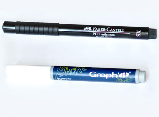
Just as in case of drawing buildings, I used a thin waterproof pen (size XS) for making contours. Metal details were highlighted with a white opaque marker. I was using it for the first time so I had no idea what kind of results should I expect. For me it's like a very thin corrector (0.7 mm):


During such exercises you probably won't have an opportunity to fully express your creativity or move into the world of imagination, but hopefully it will improve your attention to details, proportions and light. Strongly recommended from time to time!


Monday, 27 April 2015

3-POINT PERSPECTIVE - TUTORIAL


Time to continue the last post . We will take a deeper insight into constructing the line drawing of "Fantasy Castle". Below you can see (and download) an exercise in a super-fun subject: 3-point perspective + a slant horizon. Naturally we could ask a question: 

"Why bother about a perspective with 3 vanishing points if there's quite a lot of work with 2-point perspective?"

Well, it emphasizes an impression of the size of an object. In this case it will highlight that the castle was build on a rock protruding from the deep abyss.

Furthermore diagonal lines are more dynamic than  vertical, parallel ones and they give an impression of a speed (with which we could fall down into the lava for example...).


Hopefully this is useful somehow! The same tutorial (along with several other tutorials) is on the subpage "TUTORIALS" .

Thursday, 23 April 2015

"Fantasy Castle"


“I know only one thing. When I sleep, I know no fear, no  trouble, no bliss. Blessing on him who invented sleep."

Stanisław Lem, "Solaris"


This is a  kind of prelude to the tutorial about 3-point perspective. I'll present here how the drawing was created step by step. Whereas principles of perspective will be explained in the next few days in a downloadable tutorial somewhere here http://grimdreamart.blogspot.com/p/tutorials.html. (At least that's the plan)


1. Setting a composition. Guiding lines were made with a pencil:


2. Aha! experience - it will be a castle. At this stage there are lots of constructional lines and I'm still not sure what shape the castle should eventually have. Using a pencil rather than a pen is much more safe right now:


3. When all what's desired is fixed with a waterproof pen (Faber-Castell Pitt Artist Pen is my personal favorite), we can get rid of additional interrupting lines. Well, it doesn't look excessively awesome, so...


4. Let's make some additions: windows, ornaments, dragons. It's immediately more cheerful, isn't it?


5. Time for watercolors. It's better to start with the environment before we'll go to the main subject. Apparently it's not necessary to choose warm colors for the foreground and the colder ones for the background. In some circumstances an exactly opposite approach can also work out well. Let's try it!


That's how the background looked like before it dried up. Grains of salt bravely absorb water and leave a fancy pattern:


6. These additions mentioned in the step 4...ekhmm, they're easier to draw with a pen than to paint with watercolors. I should have thought about that earlier...


7. Now it's time for textures made with a thin brush and dense paint. What's even more important I had to work further on overall color settings and  unify the whole painting. It required using a broad brush and diluted paint (yellow, purple and opaque gold):


8. Working on details with a pen once more. The whole drawing looks more "sharp" that way: