Showing posts with label music album. Show all posts

Saturday, 23 September 2017

BLIGHTINGALES - music album illustrations


Based on my long and insightful researches (i.e. checking “likes” on Facebook and Behance and posting a one-question questionnaire on DeviantArt) I discovered, that my viewers/readers are most interested in my gothic illustrations.

Oddly enough, I don’t have too many opportunities to make such artworks. But today I can finally share with you a mysterious, ruined gothic cathedral painted as a cover illustration for a grey-metal (doom-death-symphonic black) band “Darken My Grief”.


So far I could only listen to a few demo fragments, but I hope I managed to capture an appropriate atmosphere. Luckily the band’s frontman – Duddu had quite a clear vision regarding the whole graphic design.  Considering this, the task may sound like a piece of cake, but in practice, it meant seemingly endless editions of the whole mass of tiny little elements. Apparently, that’s what happens, when two perfectionists meet. Anyway, the final result was worth the effort!

One of my ugly concept sketches – let’s call this phase “a necessary pain”. Probably at this stage the clients are seriously wondering whether they made the right choice when hiring me:

The final illustration – I had almost a total freedom here. The only requirement was to capture a woman and a flock of birds. So I decided to put them in a gothic environment (with cathedral’s ruins in a shade of whitened bones. Charming, I know):

The front cover design:

The back cover illustration (probably you can notice letters DMG hidden in the central symbol resembling an angel – this symbol is actually frontman’s brilliant idea):

Some of the lyrics backgrounds:


And now I’m waiting impatiently to listen to their music...  

Friday, 13 December 2013

Electric Guitar


“You couldn't not like someone who liked the guitar.” 

     Stephen King, "The Stand"
 

The theme of today's post are drawings for an album "Schematics" by a band called Bees with Guns (several views of an electric guitar in a style of Leonardo da Vinci). Perhaps "an electric guitar in a style of Leonardo da Vinci" sounds a little strange at first, but it's absolutely logical in fact. I was meant to present a guitar of a band leader - Ben Willms on an old, damaged paper. I've got some experience in drawing guitars ( http://grimdreamart.deviantart.com/art/guitar-60298768  ), as well as in "damaging" paper, so I got to work willingly. 

Tematem dzisiejszego wpisu są rysunki do albumu "Schematics" zespołu Bees with Guns, czyli kilka ujęć gitary elektrycznej w stylu Leonarda da Vinci. Być może "gitara elektryczna w stylu Leonarda da Vinci" początkowo brzmi nieco dziwnie, ale jest to w gruncie rzeczy w pełni logiczne. Założeniem było stworzenie technicznych rysunków gitary należącej do lidera zespołu - Bena Willmsa na starym, podniszczonym papierze, z zachowaniem wszystkich konstrukcyjnych linii pomocniczych. W rysowaniu gitar mam pewną wprawę ( http://grimdreamart.deviantart.com/art/guitar-60298768  ), w "postarzaniu" i "podniszczaniu" papieru też, toteż z chęcią przystąpiłam do działania.


1. Concept sketches. Quite "messy" but the trick was to place a very oblong object  in a square frame. 

1. Szkice koncepcyjne. Dość niedbałe, ale cała sztuka polegała na tym, żeby w kwadratowym kadrze umieścić bądź co bądź bardzo podłuży przedmiot. 
  
2. Old paper. We'll need: new paper ( yellowish, watercolor paper is recommended ), Broad brush, several shades of brown watercolors, lots of water, salt and tissues. Paper should be strongly soaked. We don't have to worry that paper will get creased  - ultimately it should be  "worn-out". We place very diluted paint here and there. We can both paint with a brush directly on the paper and splash watercolors  from a brush. Next we sprinkle it with salt. Slowly and delicately we move the paper, so the paint could flow in various directions. 

2. Stary papier. Potrzebne będą : nowy papier (do akwareli, najlepiej żółtawy), spory pędzel, kilka odcieni brązowawych akwarelek, dużo wody, sól i chusteczki higieniczne. Papier solidnie moczymy. Nie trzeba się przejmować tym, że się pofaluje - w końcu ma być podniszczony. Bardzo rozwodnioną akwarelę nakładamy tu i tam (częściowo malując pędzlem bezpośrednio po kartce, a częściowo chlapiąc farbą z pędzla. Następnie szybko posypujemy całość solą. Powoli i w miarę delikatnie poruszamy kartką, żeby  akwarela mogła swobodnie rozpłynąć się w różnych kierunkach.   

3. The final drawing was based on the first sketch. This time first I made a drawing and then I added textures of an old paper. Thanks to a wonderful computer technology (which I do not overuse in fact) grey pencil's graphite turn sepia. Also descriptions were providently added with a tablet. In one of previous posts  ( www.grimdreamart.blogspot.com/2013_08_01_archive.html ) I mentioned about my numerous typos, which emerged also this time.

3. Finalny rysunek na podstawie szkicu nr 1. W tym wypadku najpierw powstał rysunek, a potem przystąpiłam do "postarzania" papieru. Dzięki niezastąpionej technice komputerowej (której wprawdzie nie nadużywam) szary grafit ołówka nabrał nieco odcienia sepii. Również podpisy zostały przezornie dodane na teblecie. W jednym z poprzednich wpisów ( www.grimdreamart.blogspot.com/2013_08_01_archive.html ) wspominałam o moich licznych literówkach, których i tym razem nie brakowało.

4. One of additional illustrations for the album.

4. Jedna z dodatkowych ilustracji do albumu.   


Sunday, 25 August 2013

Saloon

"You might not understand where my passion lies, but I know, deep down, I can't find another "
The Ongoing Concept, "You Are the One"

Last year I was working tirelessly on illustrations and graphic design for the new album "Saloon" of a band called "The Ongoing Concept" https://www.facebook.com/theongoingconcept (yes, the quote at the beginning of the post is not a coincidence :) ). The booklet was meant to look like some kind of diary in a Western-style (with sketches and handwriting texts). The album has been released this week, so I can finally show you fragments of this "diary"!

W zeszłym roku pracowałam niestrudzenie nad ilustracjami i opracowaniem graficznym nowego albumu "Saloon" zespołu "The Ongoing Concept" https://www.facebook.com/theongoingconcept (owszem, cytat z początku tego wpisu to nie przypadek :) ). Założenie graficzne było takie, żeby album przypominał dziennik z czasów "dzikiego zachodu" (z odręcznymi zapiskami i szkicami). Ponieważ premiera albumu miała miejsce w tym tygodniu, mogę się w końcu pokazać Wam fragmenty owego "dziennika"!

I scanned several homemade "old papers" - crumpled, ragged, yellowish pages stained with sepia watercolors. Then, on a graphic tablet, I made illustrations imitating pen drawings. They were based on previous hand drawn sketches. 

Zeskanowałam kilka "starych papierów" własnej roboty - pogniecione, naddarte, żółtawe kartki z plamami akwareli w kolorze sepii. Następnie, na podstawie odręcznych szkiców, narysowałam na tablecie ilustracje przypominające rysunki piórkiem. 


But the handwriting was what entertained me the most (all texts were written on a graphic tablet letter by letter). It appeared that it takes MUCH MORE time than writing on a sheet of paper. At the beginning I presented six versions of my handwriting. The winner was my favorite "Font #3" (unfortunately one of the most labor-intensive). What's even worse, I've got a nasty tendency to make spelling errors. So even though I was double checking all lyrics, guys from the band still could find some typos.

Najwięcej zabawy było jednak z pismem odręcznym (wszystkie teksty zostały napisane odręcznie na tablecie literka po literce). Okazało się, że zajmuje to ZNACZNIE więcej czasu, niż pisanie na kartce. Najpierw przedstawiłam sześć próbek mojego pisma. Wygrała moja ulubiona "Czcionka nr 3" (niestety jedna z najbardziej pracochłonnych). Do tego, ze względu na moją skłonność do robienia błędów ortograficznych, nawet po dwukrotnym sprawdzeniu przeze mnie poprawności tekstów, panowie z zespołu znajdowali literówki.  


At the end here's one of The Ongoing Concept's video - "Arrows Before Bullets" 
Na zakończenie jeden z teledysków The Ongoing Concept - "Arrows Before Bullets"


Saturday, 29 June 2013

Grunge Textures


"The future is just a f*** concept that we use to avoid being alive today. So, be here now."

Six Feet Under


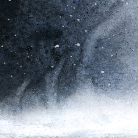
Today I'm going to show you my experimental method for creating "grunge" texture of a night sky. I tried it out when I was making a   project of a music album cover.

Dzisiaj przedstawię mój eksperymentalny sposób na otrzymanie  "grunge'owej" tekstury nocnego nieba (wypróbowałam go przy okazji projektu okładki albumu muzycznego).


1. Little white spots - it's just a white paper. They are created by splashing masking fluid with a toothbrush. We've got to take care of them at the beginning of work. When the illustration is finished and dry, we can peel off masking fluid and see little fragments of a white paper.

1. Jasne plamki - to nic innego jak czysta kartka. Powstają one przez rozpryskiwanie fluidu maskującego za pomocą szczoteczki do zębów. Trzeba o nie zadbać na samym początku malowania. Kiedy ilustracja jest skończona i sucha, można ściągnąć zaschnięty fluid maskujący, pod którym zachował się biały papier.


2. Colorful stains (well, they could be colorful if I had used more diversified colors)- we put very diluted paint on a solidly wet paper (I used here blue, green, violet and a bit of black paint). We can delicately set the paper at different angles so the stains can merge here and there into a coherent whole.

2. Wielobarwne plamy (tzn. mogłyby być w pełni wielobarwne, gdybym zastosowała bardziej zróżnicowane kolory) - na solidnie zmoczoną kartkę nakładamy bardzo rozwodnioną akwarelę w różnych kolorach (tu niebieski, oliwkowy, fiolet, odrobina czerni). Można delikatnie poruszać kartką, żeby plamy połączyły się gdzieniegdzie tworząc wrażenie spójnej całości. 


3. "Cloud-like" textures -when the watercolor paint is still wet, we push a crumpled tissue to it (right, I used a cheaper substitute - good, old toilette paper).

3. "Chmuropodobne" tekstury - Kiedy akwarela jest jeszcze mokra, przyciskamy do niej pogniecioną chusteczkę higieniczną (racja, ja używam tańszego substytutu - starego, dobrego papieru toaletowego).


4. Fog/ steam - a tactic is similar to the one from the previous point, but this time we wipe the paint harder using  a tissue with a "self-made tip".  

4. Mgła/para - taktyka podobna do tej z  poprzedniego punktu, ale tym razem wycieramy farbę mocniej, za pomocą chusteczki z "własnoręcznie ukształtowaną końcówką".


5.  Irregular texture - well know and loved salt. We drop several grains of salt on the paper with wet watercolor paint. The more wet paint and the bigger grains, the clearer results can be achieved.

5. Nieregularna tekstura - znana i lubiana sól , którą posypujemy kartkę z mokrą akwarelą (wystarczy kilka ziarenek). Im większe ziarna i bardziej mokra akwarela, tym wyraźniejszy efekt.


We've got to accomplish steps 2-5 pretty fast, when the watercolor is still wet. And when it gets dry, we can proceed the next step:
6. Little dark spots - we splash dark paint with a toothbrush. In the end we can peel off masking fluid to reveal little white spots.

Z wykonaniem punktów 2-5 trzeba się uwinąć, kiedy akwarela jest wciąż wilgotna. Natomiast kiedy wyschnie, można przystąpić do następnego kroku:  
6. Ciemne plamki - za pomocą szczoteczki do zębów rozpryskujemy ciemną farbę. Na koniec zdejmujemy fluid maskujący odsłaniając jasne plamki.


Dear watercolor painters - contrive, devise your own methods for new, interesting textures and HAVE FUN!

Drodzy akwareliści - kombinujcie, obmyślajcie własne sposoby na nowe, ciekawe tekstury i BAWCIE SIĘ DOBRZE!